When something is overflowing, it just means it’s too big to fit inside the thing it’s in. Like pouring too much water into a glass — the water spills over. That’s overflow. It happens in the real world, and also in the world of CSS.
I say CSS here, because overflow usually occurs when you give elements fixed widths or heights. It’s kind of hard to overflow with just plain HTML — unless you toss in a mega-large image or an unbreakable word.
For example, if you have a <div> with a fixed width of 200px and you put a <p> inside it with a long word like “supercalifragilisticexpialidocious”, the word will overflow the container.
<div class="container">
  <p>supercalifragilisticexpialidocious</p>
</div>
.container {
width: 200px;
border: 1px solid black;
}Normally, text wraps automatically (especially inside paragraphs), so it won’t overflow unless you stop it from wrapping or give it nowhere to go.
    p {
      /* default value */
      /* lines wrap */
      white-space: normal;
    }

    p {
      /* lines don't wrap */
      white-space: no-wrap;
    }
This example is just one of many that shows how it’s often the author (you) who breaks things by adding CSS to an otherwise inherently responsive base. User agent styles — the default styles applied by the browser — are typically quite flexible and responsive by default.

WTF is a user agent?
Agent = a person who acts on behalf of another person or group.
A user agent is the software (usually a web browser) that acts on behalf of the user to retrieve, render, and display web content. It also applies default styles to HTML elements via a built-in user agent stylesheet.
So back to the example of the overflowing glass of water. Let’s say we have this structure:
<div class="glass">
  <img class="water" src="cat.jpg"/>
</div> div.glass {
height: 200px;
}
img.water {
height: 400px;
}
The <img> is much larger than its container and would therefore “spill out”. The glass would overflow, causing a bit of a mess.
This can cause problems, especially if the overflow happens on the x-axis, giving us that dreaded horizontal scrolling ( which is really bad UX).
To control this behaviour we have the overflow property in CSS, which is a shorthand for: overflow-x and overflow-y.
This means that if we give it one value it would resolve to both the x- and the y-axes. And if we give it two values the first one would be for x and the second for y.
  img {
    /* both axes - x and y */
    overflow: hidden;
  }
  img {
    /* hidden for x - visible for y */
    overflow: hidden visible;
  }
Preventing overflow
So, what options do we have to prevent overflows? Well, we could either just “hide” the parts that are overflowing. Or we could create a scroll container, to make the overflow scrollable. A scroll container you say? What the hell is that?
Well here is the definition from MDN:
A scroll container is an element box in which content can be scrolled, whether or not scroll bars are present. A user agent adds scroll bars to an element box to make it a scroll container when the CSS overflow property is set to scroll or when overflow is set to auto and the content overflows the container.
Technically
overflow:hidden also creates a scroll container, even though you can’t scroll it. The content could still be scrolled programmatically, but the user can’t do it.
Bunch of words… Lets simplify: A scroll container is a HTML-element that has overflow set to either scroll or auto. Meaning that if you cram something inside of this element that doesn’t fit, would make it scrollable instead of it overflowing.
Like, think about it. This is kinda genius. It pretty much becomes a
Ok, so whats the difference between scroll and auto?
Shit… yeah i guess i’ll have to try and answer that.
According to MDN, overflow: scroll will make the user agent display scroll bars whether or not any content is overflowing. A benefit of this would be that it prevents scroll bars from appearing and disappearing as content changes.
overflow: auto unlike scroll, only shows scroll bars if the content is overflowing.
However, when i tried both scroll and auto i did not find any notable difference. When using scroll on an element that wasn’t overflowing, i did not get any scroll bars. So, unless i’m missing something, they pretty much behave the same way in practice.
Sick! What more values could we throw at overflow?
Here is the list:
/* Keyword values */
overflow: visible;
overflow: hidden;
overflow: clip;
overflow: scroll;
overflow: auto;
All elements have overflow set to visible by default. That just means: if you put something big inside something small, the overflow will spill out and still be visible.
overflow: hidden hides the parts that don’t fit — no scrollbars, no way to reach them. Just clipped. It’s like putting a small picture frame over a much larger photo, and then snipping off the parts that stick out. Clean and static.
But — and here’s where the metaphor breaks down a bit — the content isn’t actually gone. Unlike scissors cutting a photo, overflow: hidden doesn’t remove the overflow, it just hides it from view. The content is still there in the DOM and can affect things like focus, screen readers, or JavaScript measurements.
By setting an elements overflow property to either hidden, scroll or auto, you are creating a new block formatting context (BFC).
Ok, WTF is that?
Yeah, this is a whole topic on its own — but here’s the short version: A Block Formatting Context (BFC) is a special kind of layout container in CSS. It keeps what’s inside it separate from what’s outside in two important ways:
- Floats outside won’t affect it — elements inside a BFC won’t overlap with floated elements that live outside of it.
- Margins won’t collapse across the boundary — vertical margins inside the BFC won’t “merge” with margins outside it.
Floats and margin collapsing… do i need to know about this? Maybe not, but it’s good to understand that when you change certain properties, you also change how CSS renders certain parts of a web page. Flex and grid children that are not themselves grid or flex containers, also create new BFCs, for example. Grid and flex containers create something similar to a BFC - grid/flex formatting contexts, which behave similarly in some ways (like float containment) but are distinct layout models with their own rules.
Here is a short example showing margin collapsing:
  <section>
    <article>
      <p>hello</p>
    </article>
    <article>
      <p>hello</p>
    </article>
  </section>
  article {
    margin-top: 0;
    margin-bottom: 0;
  }

  p {
    margin-top: 10px;
    margin-bottom: 10px;
  }
How much margin is it between the articles? Should be 10px + 10px, right? But no, the top and bottom margin would collapse here, effectively making it 10px of margin between the articles.
How margins really work
This example also touches on how margins really work. You’d think that the margin would “push” the <p> 10px down from the article “ceiling” and 10px up from the article’s “floor”. But this really is the job of paddings. Margin doesn’t increase gaps between a child and its parent’s boundings. Its purpose is to increase the gap between adjacent elements - siblings.
Instead it would “bubble” up, or “escape” to it’s parent here and collapse with the other article. It would be as if we had put the margins on the article. Margins want to increase the space between siblings, so this is what it will try to do here even though the margin is set on the child. Confusing? Yeah, it is. But this is how it works.
So, these margins will collapse. But only as long as there isn’t “something in between” the two touching elements. That something can be another <element>, a border or some padding. Borders and paddings sort of creates unbreakable barriers that stops the merging or collapsing of margins.
Think of it as hands reaching out from elements. When two elements meet, their margins don’t add up but instead merge together like hands intertwining, taking only the space of the larger margin. Adding padding or borders creates an invisible wall between the hands, preventing them from passing through and intertwining, so margins remain separate and add up rather than collapse.

There is also another way to prevent margin collapse. Remember how we said that elements inside a BFCs vertical margins don’t collapse with those of elements outside? And remember how we talked about how overflow: auto | hidden | scroll on an element would create a new BFC?
Sooooo, we could set the overflow on one of the articles to either of these values:
  <section>
    <article class="x">
      <p>hello</p>
    </article>
    <article>
      <p>hello</p>
    </article>
  </section>
  article {
    margin-top: 0;
    margin-bottom: 0;
  }

  article.x {
    overflow: hidden;
  }

  p {
    margin-top: 10px;
    margin-bottom: 10px;
  }
Article x now has a block formatting context and it’s margin-bottom won’t collapse with the margin-top of the next article.
However, setting overflow on an element, just to create a BFC, isn’t always a great idea (if you dont also want the overflow behaviour). This is where display: flow-root comes in. Its almost like display: block, except that it also creates a BFC. Yay 🥳!
The name “flow-root” indicates that we are creating a new root-like element in terms of how it creates context for a flow layout inside. Bunch of words again…
Anyways. Here is a list of stuff that creates block formatting contexts:
- The root element of the document. The OG BFC. The
<html>tag. The only BFC on a page as long as you don’t use any of the below stuff. - Floats 🤢
- Absolute and fixed positioned elements
- Table stuff
- Inline-blocks
- Overflow with values other than visible and clip
- Flow-root
- Elements with contain set to layout, content or paint
- Flex & Grid items
- and some other obscure stuff…
Holy crap, enough with the block formatting contexts already!! Yeah, i know! I don’t quite understand them myself. But being aware, just knowing they exist and that they change fundamental behaviour, could make you go “Ah right, this creates a new block formatting context, maybe that’s why things are weird”, the next time you try to debug some weird margin collapsing or whatever.
Layout modes
This leads me to stray even further away from the initial topic. Namely to talk a little bit about layout modes in CSS. It’s related to BFCs but still different. Basically a BFC is always part of a layout mode, but not all layout modes are BFCs.
Layout modes are broad systems for laying out elements.
A BFC is a specific kind of box inside certain layout modes (mainly block) that affects things like margin collapse and float containment.
Ok, so an element can have a layout mode AND a BFC? Yes! In fact - many layout modes automatically trigger a BFC.
But what is a layout mode? Basically the browser calculates and renders HTML according to a layout algorithm. There are a couple different ones to choose from like: Positioned, Flex, Grid, Flow and Table.
By default all elements (except for tables) use the Flow layout (or Normal Flow). This is the layout mode that was used when the web was created some 500 years ago, and that is still used today (although now we can opt in to other modes, like Grid or Flex). In Flow we have the block boys, displaying one after the other, top and bottom. And we have the inliners, just lining up next to each other, left and right. They all know about each other and work together to form a layout. But if you, for example, slap a position: absolute on an element, that element is now taken out of flow, and can be considered to have gone rogue. It is now an outcast and works independently, ignoring all previous friends and neighbours. It doesn’t respect the rules anymore and is basically invisible to the rest of the gang. It has left society entirely.
The most stupid metaphor ever
What if you slap display:flex or grid on an element, would that guy also go completely mental? No, not really. That element would remain within the normal flow with respect to its siblings. It would remain in “Flow City”, following its rules and regulations. However… its children would now have a new ruleset to abide by.
It is like that flex or grid container is a prison building within “Flow City”. The prison is still part of society. But inside the prison, a new society would form with a different set of rules to follow. But they’d still have to respect, be aware and adjust to each other and maintain relationships.
Here’s also a big difference in how grid and flex fundamentally works. In grid layouts the parent decides how the layout should behave. In flex - it’s the children that decides.
In the Grid prison, it is the warden (the parent) that is in charge, dictating exactly how the prisoners (the children) should behave.
In the Flex prison, the prisoners have rioted, a <span-iard> with flex: 1 is now top dog.
So what is the takeaway here? It’s that rules that apply in a Flow layout, doesn’t necessarily apply in a flex layout, for example. In fact, many properties behave very differently. Widths and heights are good examples of this. They behave pretty intuitively in a flow context. You give something a width of 100% and it takes up the full space. In a grid or flow context, that might not be true, since there is a lot more going on in these layout algorithms.
So, the next time something isn’t acting the way you thought it would, try to figure out what layout mode you are in, and go from there.
z-index
Another good example is z-index. Imagine you just created a new HTML-doc. You make two divs with different background-colors, put some widths and heights on there, which gives you two boxes of different colors, and since you are in flow mode, they line up as blocks, one at the top, and the other one below it.
Now, you decide that you want them to overlap a bit. You put some negative margins on there and yeah, that looks sweet.
But wait… you want A to be on top of B instead. So you remember that there is a property that lets you rearrange items on the z-axis. Cool, you slap that z-index of 1 on A, and… nothing happens. WTF? You try z-index: 10. Nope! 100? Nope. One Thousand? Nein! INFINITY? God, why doesn’t it work?
The reason is simple. The z-index property doesn’t work in a Flow layout. Normal flow is fundamentally a two-dimensional layout system where elements are arranged either vertically (block elements) or horizontally (inline elements). There’s no built-in concept of layers or depth. There is no stacking context.
Stacking Context
In order for z-index to work it needs to be in a stacking context. A stacking context is a 3D layering system that determines how elements overlap on your screen. Think of it as creating “bubbles” where z-index works only within that bubble, not across different bubbles.
Elements in one stacking context don’t interact with elements in another - each context is self-contained and treated as a single unit in its parent context. When elements overlap, their stacking order depends on which contexts they belong to.
Stacking contexts are created by the root <html> element and by elements with specific CSS properties like position: absolute (with non-auto z-index), flex, grid, opacity less than 1, transform, filter, isolation: isolate, and several others.
Ok, phew… that was some detour. Let’s get back to overflow with yet another metaphor and some sketchy drawings.
The Overflow Metaphor
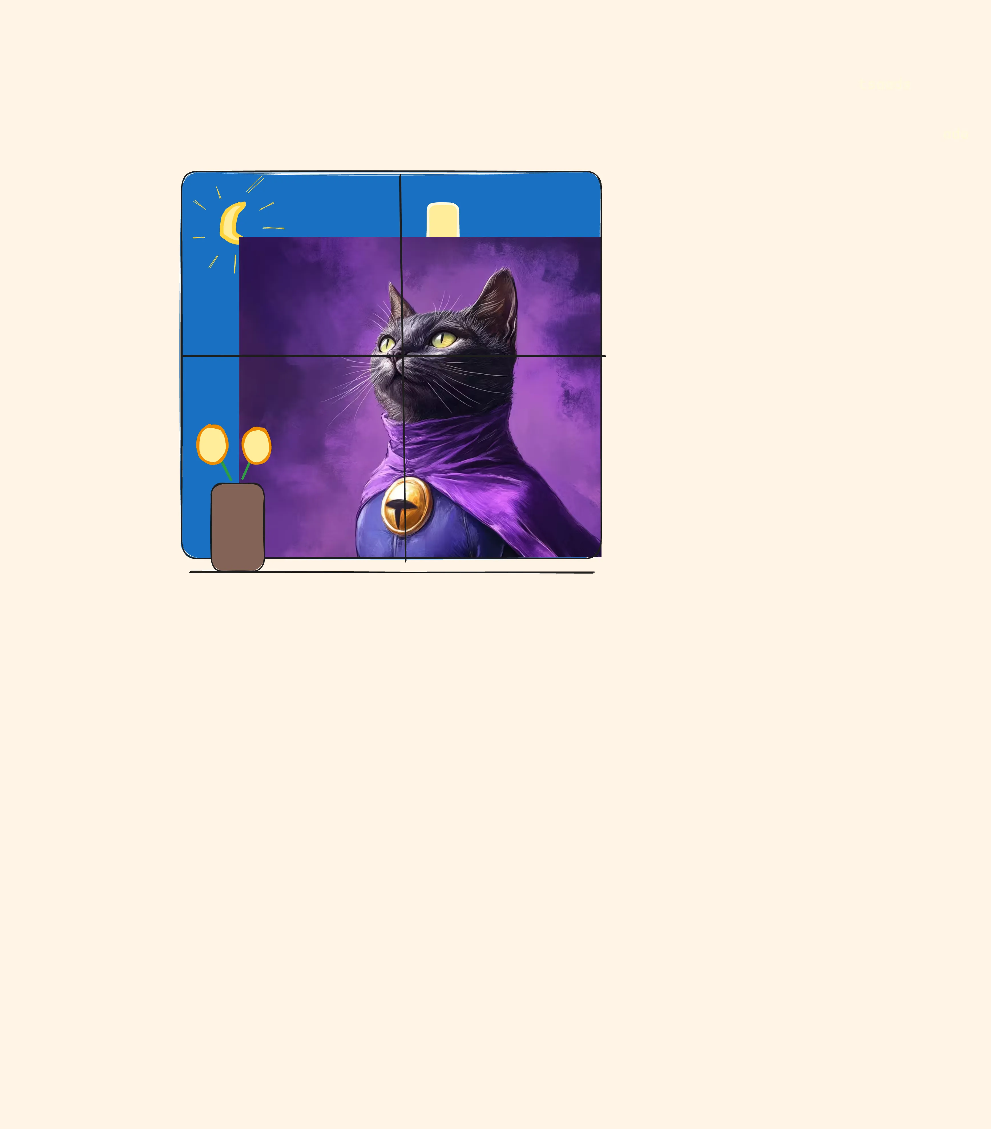
To really hammer home how the property overflow works, i like to think about it all as a room with a big old wall and a window.
The wall is your page.
Your container <div> is the window.
You place an <img> on the window.
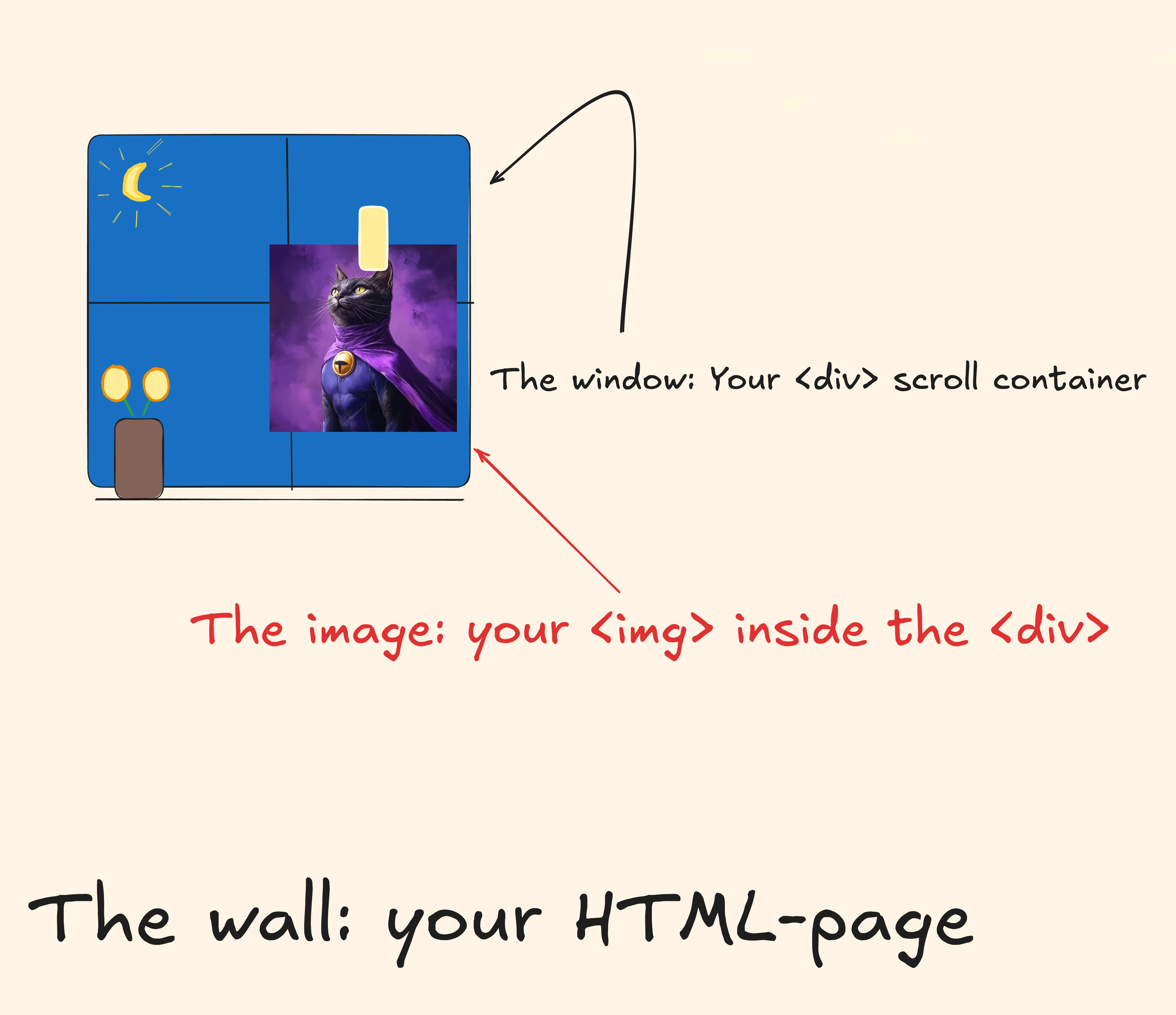
It looks nice.
You place a bigger <img> on the window, but now, it not only takes up the window’s space, it also covers a bit of the wall, maybe hiding some picture of your grandfather.
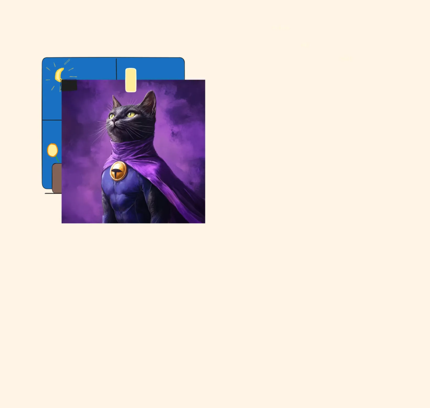
And this, dear conjurers of code, is where the true sorcery of overflow begins. You raise your wand, the DOM trembling ever so slightly, and with great flourish and with a twinkle in your eye, you cast the ancient spell:
“Overflowus hideamus!”
…and poof, the image is no longer on the inside, but on the outside.
As you know, by looking out a window, you can only see what is visible through the window, the rest is “hidden”, “cropped off” from view… but it’s still there. That is overflow: hidden for ya. Now imagine you had some scroll bars on that window, you can scrub ‘em up and down to reveal more of the outside environment, that would be overflow: scroll | auto for ya.
Now here is a gotcha. Remember how we said that overflow is shorthand for overflow-y and overflow-x?
You’d think then that you would be able to set overflow-x to hidden and overflow-y to visible, to only hide overflow on the x-axis, but no. As soon as you make an element a scroll container (by setting overflow), it will automatically transfer that <img> inside of it to the outside of the window (like in the metaphor above). There is no way then to make some part come inside again, its just physically impossible.
In the real world you could probably open the window a bit and let the cat stick its tail back inside again, but in the CSS world, that is not how it works. The <img> is now outside of the window and you can’t get it back in (unless you remove the scroll container).
You could also think about it as a stacking context, where that <img> is then moved to the bottom, but since the window is transparent it lets you see parts of it.
CSS allows mixing values like overflow-x: hidden and overflow-y: visible, but in practice, browsers ignore the visible part once an element becomes a scroll container (it gets converted to overflow:auto). The content is confined to the container’s edges, and trying to “let it spill out” in one direction while clipping in the other just doesn’t work. It’s like trying to open a window on only one side of a sealed frame — the layout model simply won’t allow it.
Clip ‘em
Ok, so what if we really need to hide something on the x-axis and let it overflow on the y-axis? We’d need something that doesn’t create a scroll container, right? Because, like we’ve established, a scroll container locks its children out of the house — you can watch them through the window, but they’re not allowed back inside. Ever again 😈.
Turns out, there’s another (newer) value we can use: overflow: clip.
clip works like hidden — overflow content is clipped at the element’s overflow clip edge. But here’s the key difference: clip doesn’t create a scroll container or a new formatting context. That means the children aren’t banished — they can stay “inside,” and you’re free to clip them on one axis and let them overflow on the other.

You also get acces to overflow-clip-margin which lets you specify how much of the overflow you wanna clip. Pretty neat.
Note
overflow-clip-margin has limited support and only works when both axes are using overflow: clip
- YouTube – Kevin Powell: Overflow Explained
- MDN: `overflow`
- MDN: Layout mode (Glossary)
- MDN: Block formatting context
- MDN: Scroll container
- MDN: Stacking context
- Josh W. Comeau: Understanding Layout Algorithms
- Josh W. Comeau: Stacking Contexts
- Josh W. Comeau: The Rules of Margin Collapse
- Ahmad Shadeed: Overflow Clip